
For this project, we were tasked with creating the official brochure for HP’s 2024 Premium Laptop Line.
Our first objective was to introduce the new laptop models. After extensive product research to identify each model’s unique selling points, we went through multiple design iterations to perfect the layout of the One Pagers. The result? A clear, concise presentation of key product specs that made it easier for sales teams to pitch and customers to remember.
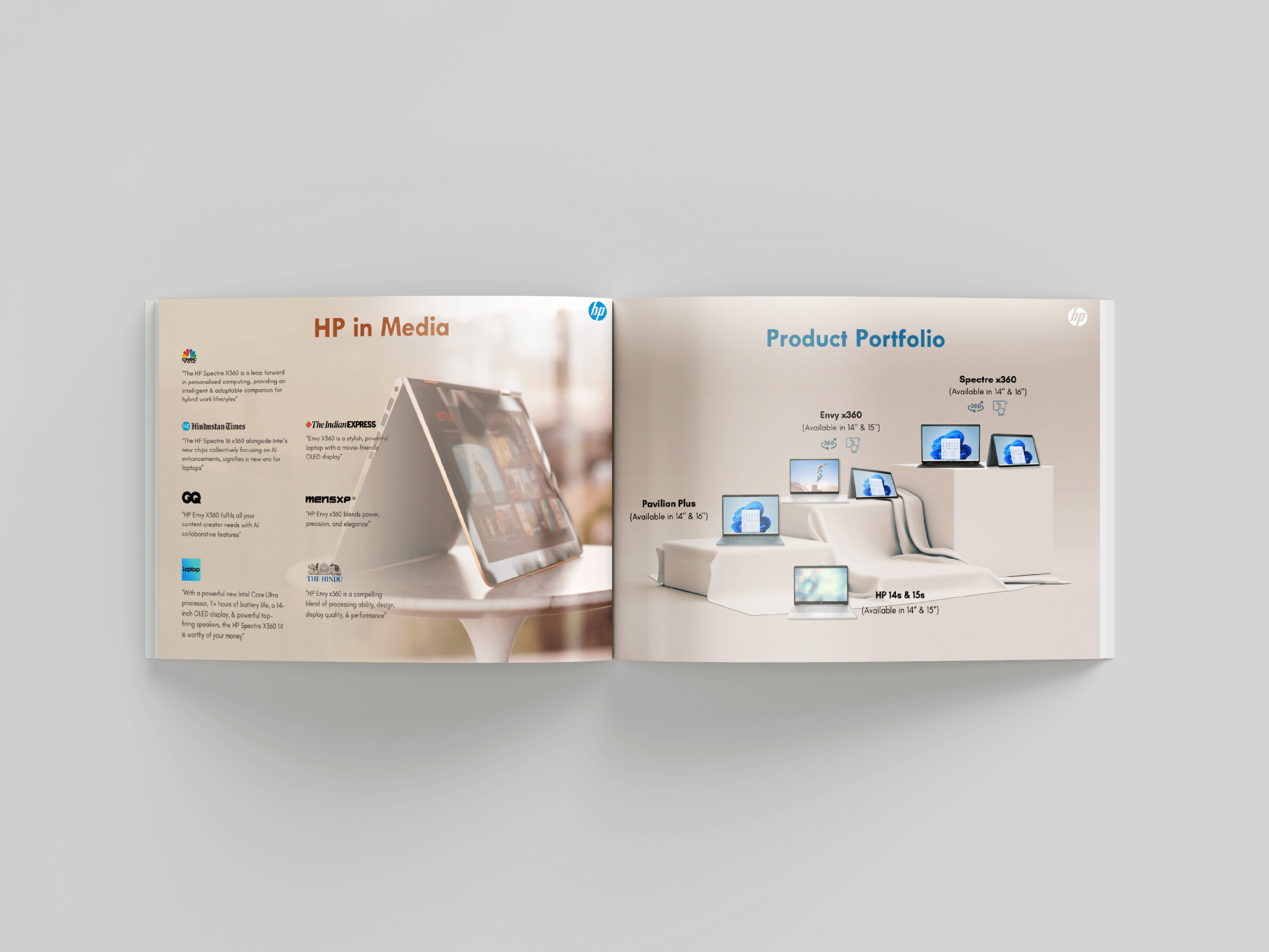
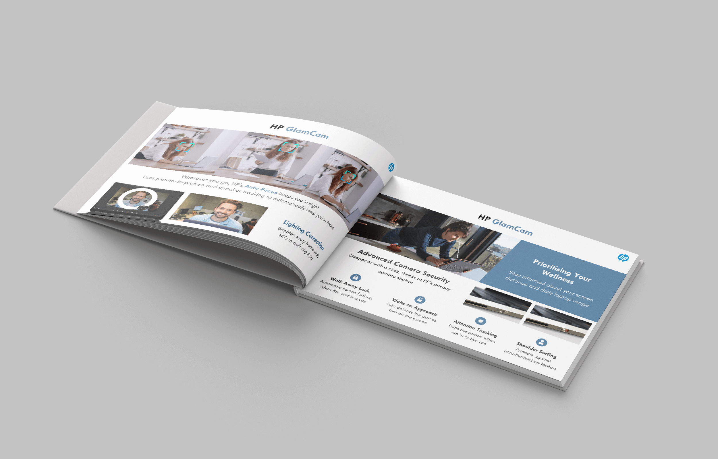
The second part focused on showcasing the “hero technologies” behind these laptops. From HP's proprietary innovations to groundbreaking advancements from partners like Intel, AMD, Microsoft, and NVIDIA, we dove deep into the tech. Armed with these insights, we crafted a compelling benefits story that made the brochure an essential resource for the company.
Initially created for HP’s sales teams, the brochure quickly gained traction across HP and partner networks, leading to its release as in-store collateral too.
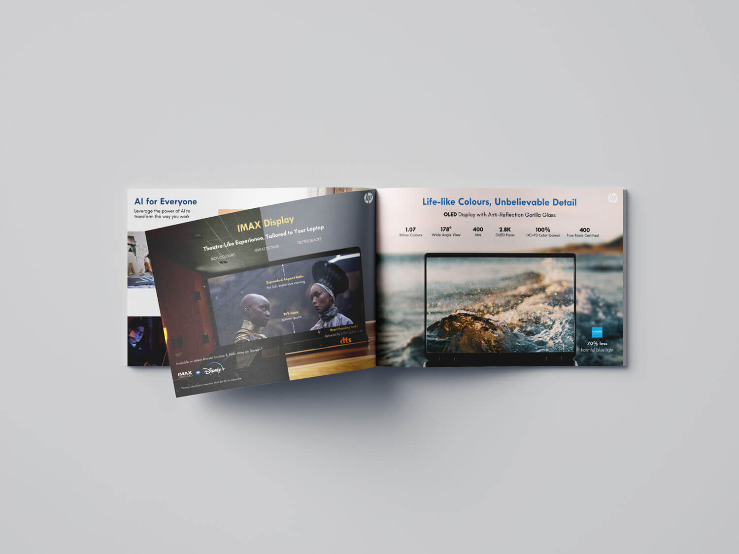
When HP approached us to create this training collateral for their sales teams, the goal was clear: crack the code on the HP Display - what is it, how is it different from other laptop displays.
What wasn’t clear? The data. Surprisingly little material around displays from HP to work with.
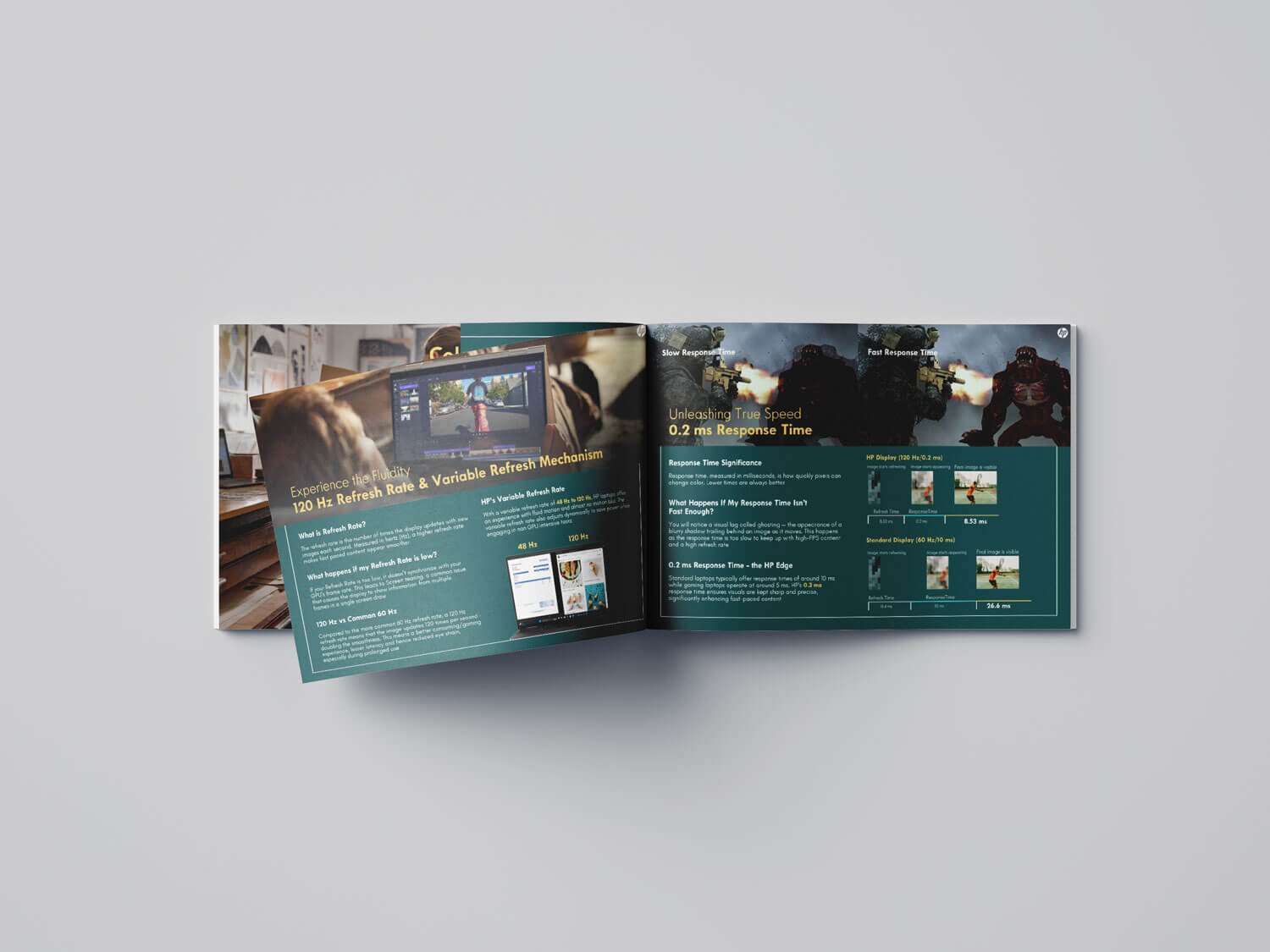
We dove deep into secondary research, combing through every technical spec available to compare HP’s display with the broader market. From refresh rates to response times, color gamuts to aspect ratios, we broke down each metric and explained how it shaped the viewing experience.
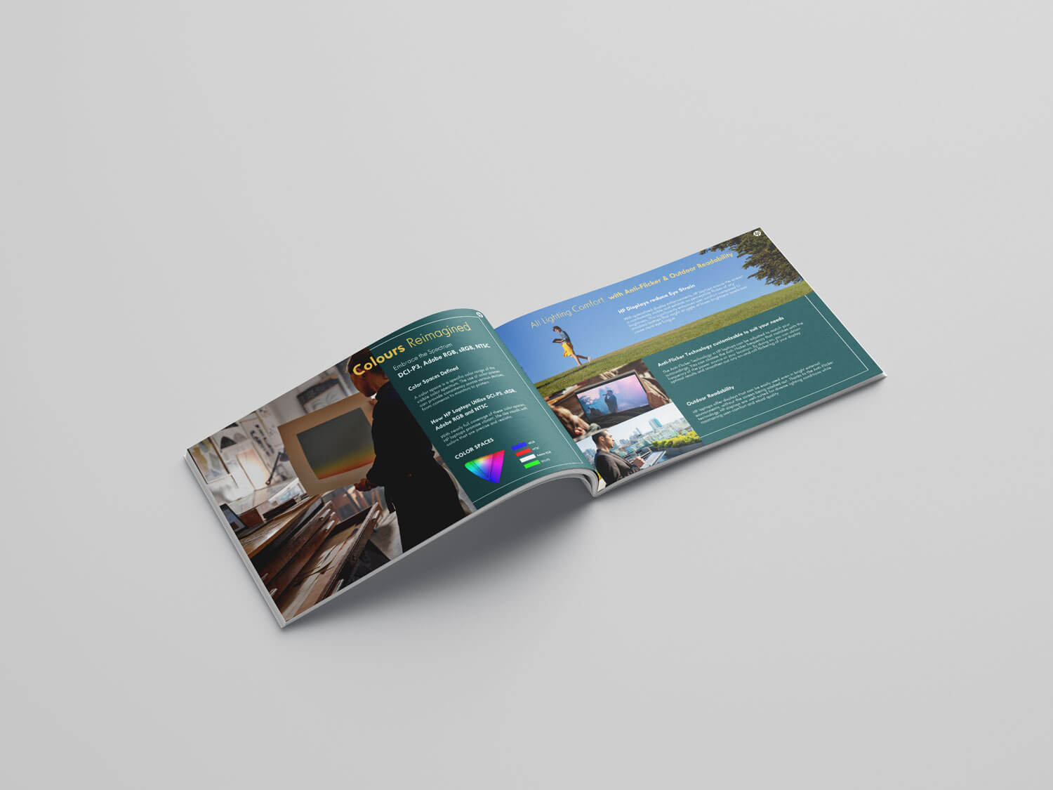
Using a combination of text, diagrams, and slick visuals, we turned dry metrics into a stylish, digestible brochure that made complex tech feel accessible. So much so that a senior leader remarked, “The Display Guide is really good. Even we learned some new things here."